

Choosing a Reunion Theme (and Carrying It Through Décor and Apparel)
A good theme is a feeling and a palette, not a costume idea. Here's how to pick one that feels intentional and carry it from invitations through the event shirts.

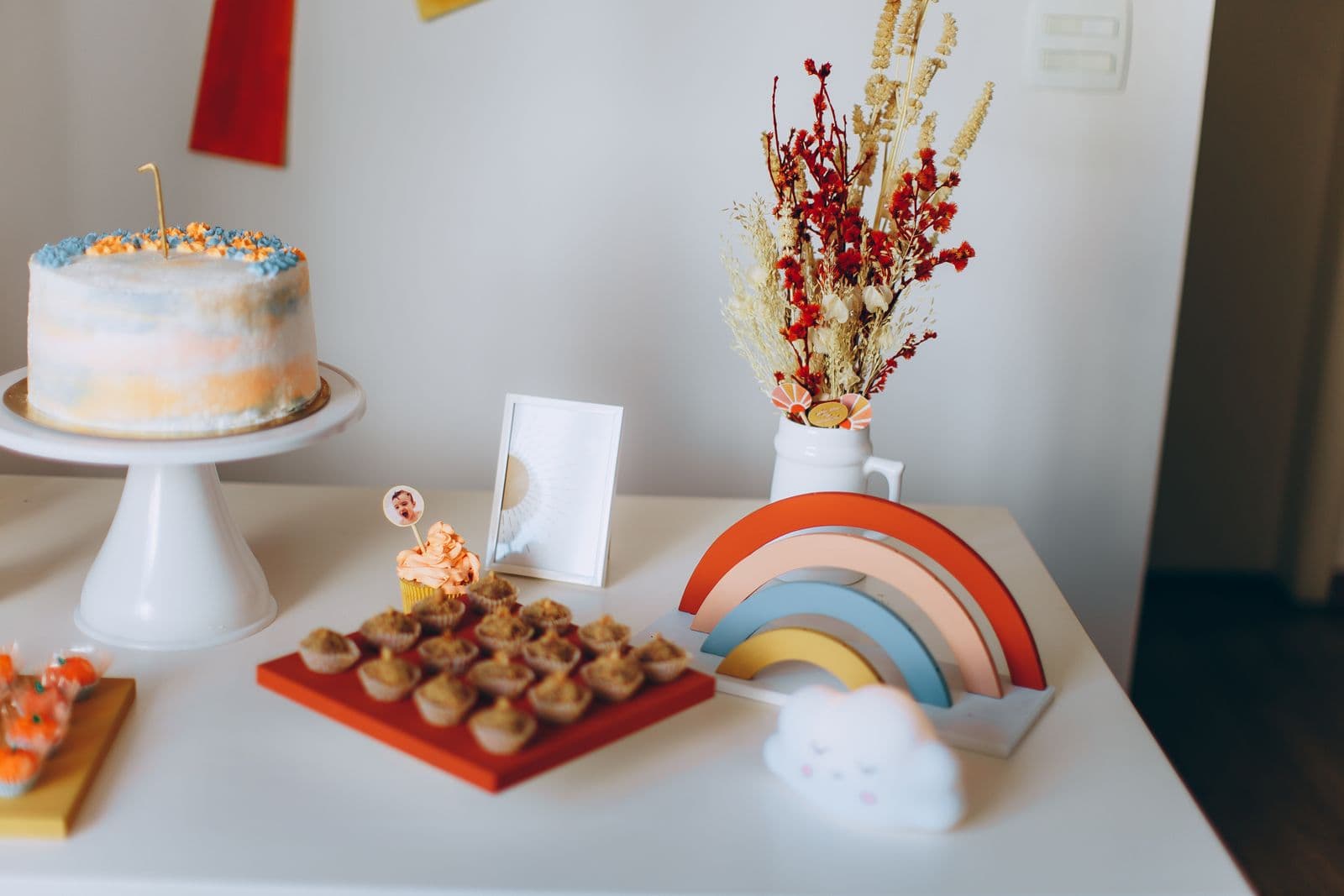
"Theme" is a word that makes some people wince, and I understand why. It conjures up plastic leis, a dollar-store banner that says the wrong decade in the wrong font, and a room that looks like three separate parties got shuffled together. That's not a theme problem, though. That's an execution problem. A good theme, chosen well and carried through consistently, is the difference between a reunion that looks like someone cared and one that looks like someone panicked at a party store forty-eight hours out.
Start with a feeling, not a gimmick
The mistake I see most often is choosing a theme as a costume idea instead of a design direction. "Tropical" becomes plastic palm trees and a limbo stick. "Western" becomes cardboard cutout cacti and a photo prop mustache on a stick. These aren't wrong exactly, but they read as costume-party thinking rather than event design, and there's a real difference in how a room feels when you walk into it.
I'd rather start with a feeling and a palette than a literal object. Instead of "beach theme," think "warm coastal evening," which gives you a palette of coral, sand, and deep teal instead of a mandate to buy inflatable flamingos. Instead of "80s theme," think "bold and a little nostalgic," which gives you saturated jewel tones and geometric shapes without forcing every table to be covered in cassette tapes. The feeling gives you permission to be selective. The gimmick makes you feel obligated to include everything remotely related to it, which is how you end up with a room that's visually loud in the wrong way.
A theme that actually works usually traces back to something true about the family or group, not something borrowed from a party supply catalog. One reunion I helped with built their whole weekend around the fact that three generations of the family had lived within walking distance of the same lake, so we went with a palette pulled straight from that water: deep navy, a soft dock-gray, and a warm gold for accents, like late afternoon sun on the surface. Nobody had to explain the theme to anyone. It just felt like them.
Picking a palette that actually survives contact with reality
Here's where a lot of good intentions fall apart: someone picks a beautiful five-color palette off a mood board, and then discovers that sourcing five colors consistently across invitations, table linens, balloons, and apparel is expensive and genuinely hard. My rule of thumb is two main colors and one accent, max. That's enough to feel rich and coordinated without turning every purchasing decision into a scavenger hunt.
Pick colors that exist in the real world of party supplies and printable goods, too. A very specific custom Pantone match sounds elegant until you're trying to find balloons or shirts in that exact shade and everything reads slightly off. Warm neutrals, jewel tones, and classic pairings (navy and gold, sage and cream, burgundy and blush) are forgiving because they exist everywhere, from the dollar store to the apparel we print. Stick to combinations you can actually source, not just combinations that look good in a design mockup.
Consider your venue's existing colors before you finalize anything. I've seen families choose a soft pink and gray palette for a reunion happening in a rustic wood-paneled lodge, and it fought the room the entire day. Pull one color from your venue itself, whether that's the warm wood tones of a barn or the deep green of a park pavilion, and let your palette work with the space instead of against it.
Carrying it through, room by room
The trick that separates an intentional-feeling event from a scattered one isn't a bigger budget, it's consistency across every touchpoint a guest sees. Your invitation sets the palette expectation the moment someone opens it. Your table settings should echo it, not introduce a new competing color because someone found a good deal on tablecloths. Your signage, your favors, and your event apparel should all pull from the same two-and-one palette you picked at the very beginning.
This is the part people underestimate about matching shirts or hoodies: they're not just apparel, they're one of the biggest visual surfaces at your whole event, and if the color works with everything else, it reads as intentional instead of like an afterthought someone added because "reunions have shirts." I've had families send us a Pinterest board built around dusty rose and forest green, and by the time we're talking shirt colors, that decision is already made. It's not a separate creative exercise, it's just the next application of a choice they'd already committed to.
If you want to see how this plays out in practice, our gallery has photos from real reunions where the palette carries from the welcome table all the way through the group photo, and you can see how much more put-together a hundred people look in coordinated colors versus a hundred people in whatever they grabbed off the hanger that morning. It's a genuinely different visual effect, not a subtle one.
Where people usually get stuck
The most common question I get isn't "what theme should we pick," it's "how do we agree on one theme when twelve family members all have opinions." My answer is always the same: let one or two people make the final call after gathering input, rather than trying to build a theme by committee. A reunion planning group text with fifteen people voting on color swatches will produce exactly what you'd expect, which is nothing, or worse, a watered-down compromise that doesn't actually commit to anything. Gather ideas, sure. Ask what era or memory the family wants to lean into. But someone needs to own the final decision and move forward, because a theme that's been negotiated into blandness is worse than no theme at all.
It also helps to decide early whether your theme is decade-based, place-based, or color-based, because that choice changes how literal you get with décor. A decade theme (a specific reunion year revisited, or a nod to when the family patriarch or matriarch was young) invites more literal props and can lean playful. A place-based theme, like the lake example above, tends to look best kept more abstract and palette-driven. A pure color-based theme, no story attached, just "we love this combination," is the lowest-risk option and honestly one I recommend to families who are overthinking the concept and just need to move forward with planning.
Don't let the theme own you
A theme should be a set of guardrails, not a rulebook you're miserable following. I worked with a family who chose a citrus-orchard theme, oranges and warm yellows, for a reunion happening near where their grandparents used to run a small grove. Gorgeous concept. But they got so locked into "everything must be citrus" that they nearly turned down a beautiful cream tablecloth because it wasn't technically orange. I had to remind them that cream is a neutral, and neutrals are what make a bold palette breathe. A theme with zero neutral space starts to feel like a themed restaurant instead of a family event.
Give yourself permission to let one element be the loud, obvious nod to the theme, whether that's the shirts, the centerpieces, or the dessert table, and let everything else support it quietly. Trying to make every single element scream the theme at full volume is exhausting to plan and, honestly, exhausting to look at too.
Turning the palette into apparel
Once you've settled on your two colors and an accent, translating that into event apparel is usually the easiest part, not the hardest. A simple, well-placed graphic in your chosen colors on a quality shirt does more for group cohesion than a busy, multi-color design ever will. When you're ready to move from mood board to order, request a quote with your palette and rough headcount, and we'll help you figure out which colors and product options actually bring the theme you picked all the way through to the group photo everyone will keep for the next twenty years.
Ready to bring your event to life?
Tell us what you're planning and we'll put together a custom quote for apparel and merch made just for your group.
Start Your QuoteMore on Décor & Keepsakes
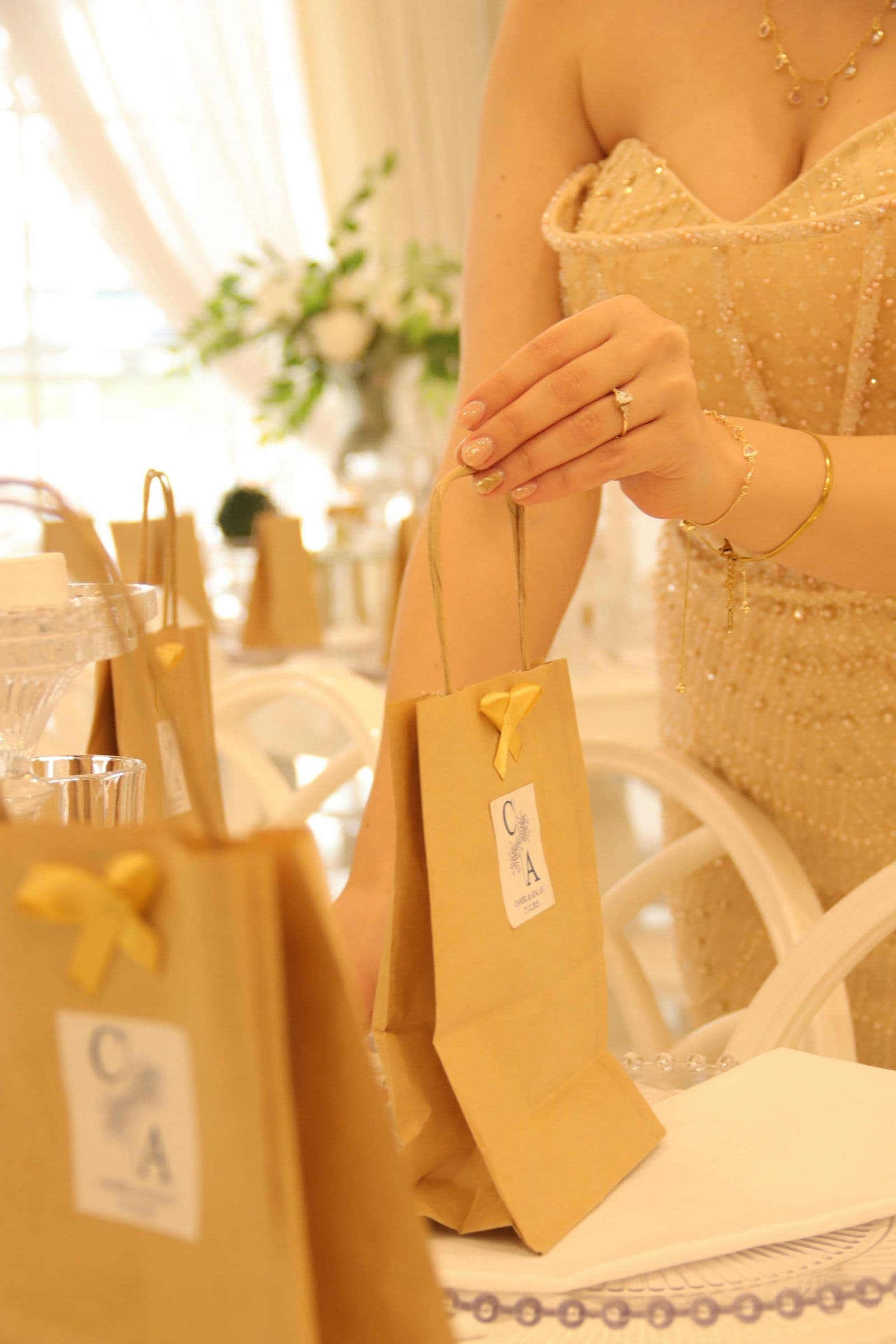
Wedding Welcome Bags and Swag Your Guests Will Actually Use
Most welcome bag items end up in the hotel trash can by checkout. Here's what actually gets kept, from local-flavor treats to drinkware guests take home for years.
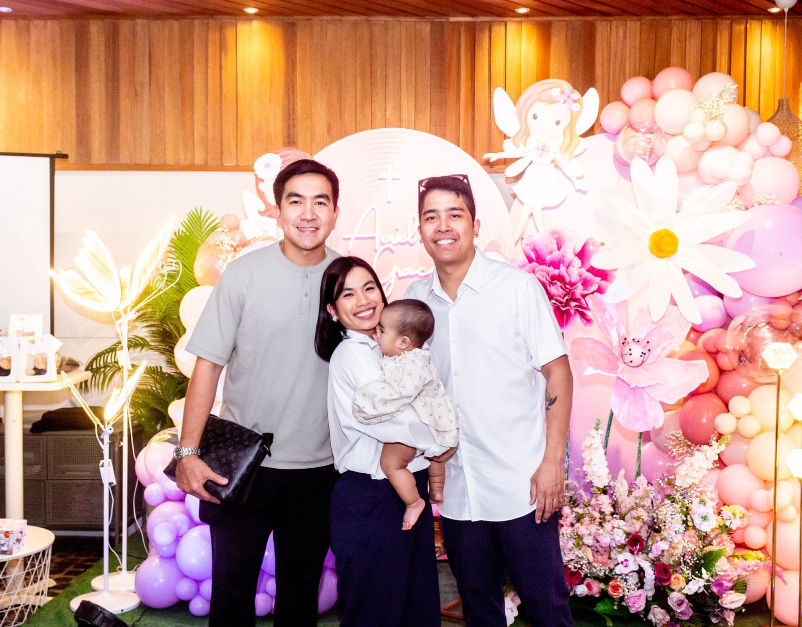
Photo Ops That Wow: Setting Up a Backdrop and Photo Booth for Your Event
DIY backdrop ideas across three budget tiers, props worth including versus skipping, and why matching apparel is what actually makes a group photo pop.
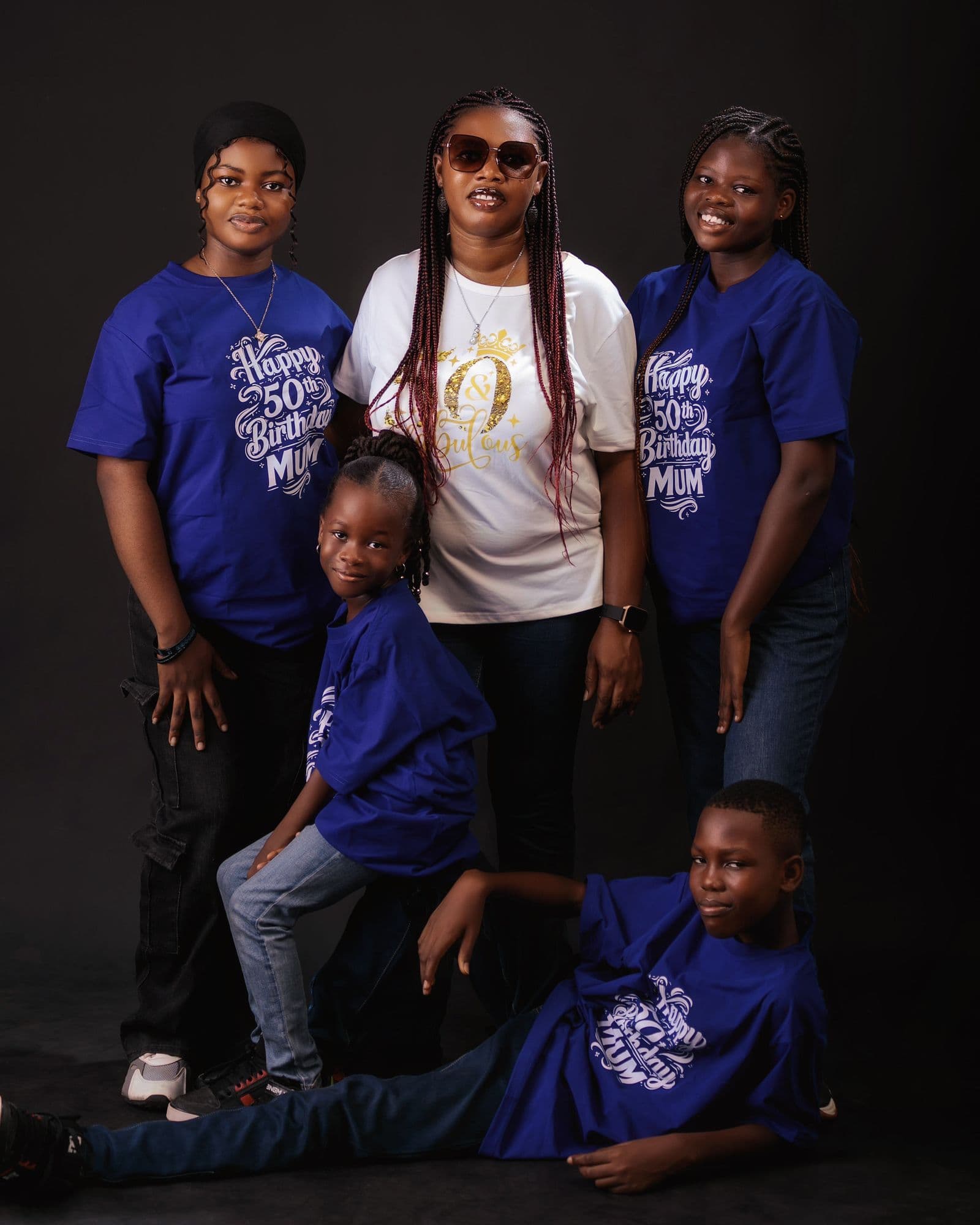
Why Matching T-Shirts and Custom Swag Bring Reunions Together
Matching apparel does more than look good in photos. It helps a crowd find its own people, becomes a keepsake that outlasts the event, and makes the group photo worth framing.